UPDATE: The Liquid Fill Gauge visual is now available to download from the Power BI Custom Visual Gallery!
–
This is a continuation of my attempt at creating a Power BI Custom Visual from an OSS d3 visual I found on GitHub. In this post I’m going to focus on the “capabilities” of the visual. Here’s the previous post: How to Create a Power BI Custom Visual Based on an Existing d3 Visual. It’s a liquidFillGauge that was originally created by Curtis Bratton.
This is Part 2 of the series, here are the other posts:
You can install this visual from the GitHub releases page here. I’ll put in the Power BI Visual Gallery once the visual is complete.
I found this page helpful when looking into Power BI Custom Visual Data Roles.
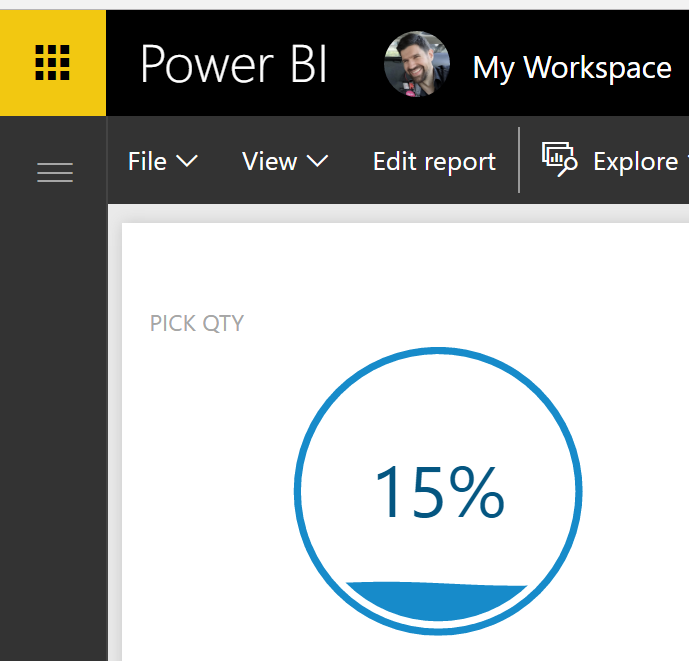
Here’s what the Liquid Fill Gauge looks like in Power BI.
In the root of your project you have a capabilities.json file. This is where you define how the user can assign data to your visual. Each “dataRole” that you define in this file can be a “Grouping”, “Measure” or “GroupingOrMeasure” data role. I think about it like this: Grouping is like categories of data, sets of data, whereas Measure is a single value…GroupingOrMeasure is when the value can either be a Grouping or a Measure.
In the case of the liquidFillGauge, we really only need to assign one value at this point - the fill percentage. The first version of the visual used the default capabilities.json file that comes with the template when created via “pbiviz new visualName”.
The default capabilities comes with two dataRoles “Grouping” and “Measure” like so:
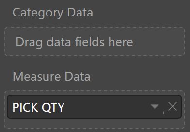
Since we only need a single value (at the moment, but we might need more in the future). We can remove the Grouping field and change the name, like so:
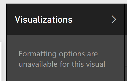
And if you just use that you’ll see this:
What you need to do is define a dataViewMappings object that tells the visual how to represent the dataRoles in the dataView. Again, this is a super simple visual right now, so all we need to do is map the single value. I’ve seen examples where “role” is equal to “Values”, but removing it doesn’t seem to impact anything, so I’m leaving it as an empty string.
You’ll also need to add the “object” property, I explain that in Part 3.
Open capabilities.json and add this code:
Your visualization pane should now look like this:
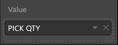
And your format property pane will look like this:
The resulting visual is the same as the original. We just now have cleaner data and format panes….and less code.
Keep following along in Part 3…
Jon