I wanted to simplify my TFS work item display so I removed a bunch of columns and and groups. It turns out you need those groups or you get something like this:
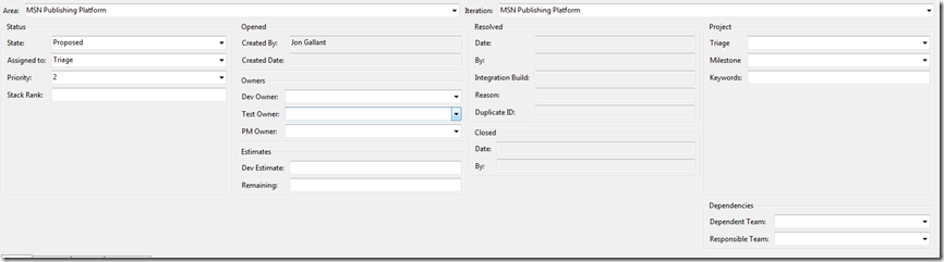
Not good since it takes up so much vertical space.
You need to add a wrapper column around each of the columns so that the contents flow inside each column:
You start with this:

Add a new group to each column:

Move the existing column to the new group you just created:

Set the width of the column to 25 (if you have 4 columns)

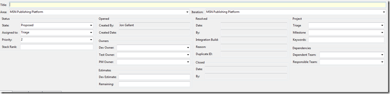
Your new layout should look like this:

Save it out and you’ll get this. Still not optimal, but at least we are now saving some vertical space.
Jon